Back to the (Digital) Drawing Board
Why Mobile Optimization Matters
We hear a lot these days about the importance of subject lines, and other techniques to get your fundraising emails to work harder. We’ve also been hearing a lot about web optimization (making sure a website functions on mobile devices) now that Google is ranking sites higher if they are mobile-friendly. But did you know that it’s also important to make sure your fundraising emails are mobile-optimized?
According to data from the US Consumer Device Preference Report, more than half of all email — 65% in fact — is now being read on mobile devices. So here are some quick design tips to keep in mind before hitting “send” for your next email:
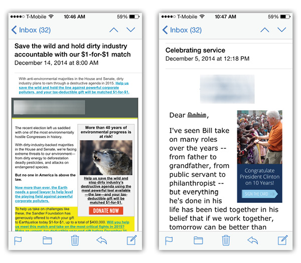
Bump up the point size of your text. We designers are predisposed to using small type, so it pains me to say this, but believe it or not, body text (the main content of your email) should be 16 points in size for optimal reading on mobile devices. I know it sounds HUGE, but as we all know, if people can’t read your message, then what’s the point in sending it?
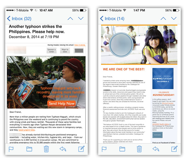
Check out the difference in these two emails — which one are you more likely to read?

And remember: the main blocks of text in any email should be in a sans-serif font (like Arial, Verdana or Tahoma). Save the fancy serif font (or the font that defines your brand) for the headlines, which, by the way, should be a minimum of 22 points in size.
Go for skinny. Enewsletters are typically presented in a two-column format, but fundraising emails with multiple columns, like the sidebar pictured below right, increase the likelihood that your text will appear smaller on the screen of a smart phone. Try starting with a single-column template, and build “down” by using divider lines to separate the content of your message. If you must use a template with a sidebar, then bump up the font size to make sure its readable.

Worried that it’s too much work to change your existing template? Don’t be! Most CRMs or ESPs offer a variety of mobile-optimized templates that are already coded for mobile. Talk to your vendors about switching out yours.
Think twice about that call to action. Every email should have at least two, and one of them should be prominent on the screen (without the reader having to scroll down) and easily tappable (even for big fingers). While you are at it, be sure to make one of them a “button” rather than just copy in the body of the email.
.jpg)
Speaking of buttons, are you still using the phrase, “click here”? It may be time to adjust that, too. Studies show that “click here” is being ignored. Just cut to the chase. Planning an event? Use “Register.” Want to drive the reader to your website? Be direct and say, “Visit mywebsite.com.” Trying to raise money? A simple “Donate” will do the trick. It’s that simple!
And remember: all links in the body copy should be underlined — you can dispense with the blue color these days, but not the underline — that’s what people now interpret as being clickable. Finally, make sure all logos and images used in your email are clickable links, too.
After the click. DonorDrive recently reported that 53% of all email opens in Q3 2014 occurred on a mobile device, and when the design of the landing page was responsive, too, the giving rate DOUBLED! If you add to that the fact that custom-branded donation pages on a nonprofit’s website raise 6X more money (reported by Network for Good Digital Giving Index) maybe it’s time to invest a little in the design of your landing pages.
Check out these two examples to see how much easier a responsive landing page can make it for your donors to give to you!
.jpg)
We hope you find these tips helpful in planning your next email fundraising campaign, and more importantly, we hope they bring you RESULTS!
eNews Signup
If you enjoyed this article and would like to be alerted when the next one is published, please enter your email address
