On Being Less Bland: An Essay on How to Avoid “Beige-ing”
Recently, Pantone released their 2025 color of the year, Mocha Mousse, that can only be described (by this designer) as the visual equivalent of a sad trombone. (It is noteworthy that this the first time Pantone has named a brown hue as its color of the year since they started the forecasting color trends in 2000.)
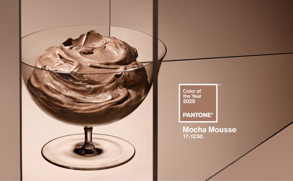
Pantone characterizes Mocha Mousse as “quiet luxury” and says it’s inspired by the “little treat” culture. This definition only reinforces a concept that I’ve been describing as the “Beige-ing of America.”
Browse any social media app for top trending aesthetic designs and inevitably your grid will be filled with an abundance of soft, bland, neutrals that fall somewhere between the cream and the chocolate of tiramisu — but much less delicious. It is social media algorithms and AI creating a monoculture.

I believe, this “blanding” of self-expression is happening because society, at large, is both overstimulated and depressed. Our reactive brains need to remove external stimuli to create a sense of control and stability, and this neutral wave is reflective of the collective mental state of America. But in the process of streamlining our lives and filtering out excess stimuli, we are losing our unique and beautiful individualities.
Why should humanity mute itself to make MORE space for pervasive digital influence?
Stand out by living in color!
Consider how much of a buzz surrounded Barbie in 2023. Pink was ubiquitous! And this past summer, even my 70 year old father was hip to the conversation surrounding Charli XCX’s Brat Green by declaring to me one evening “I am brat.”
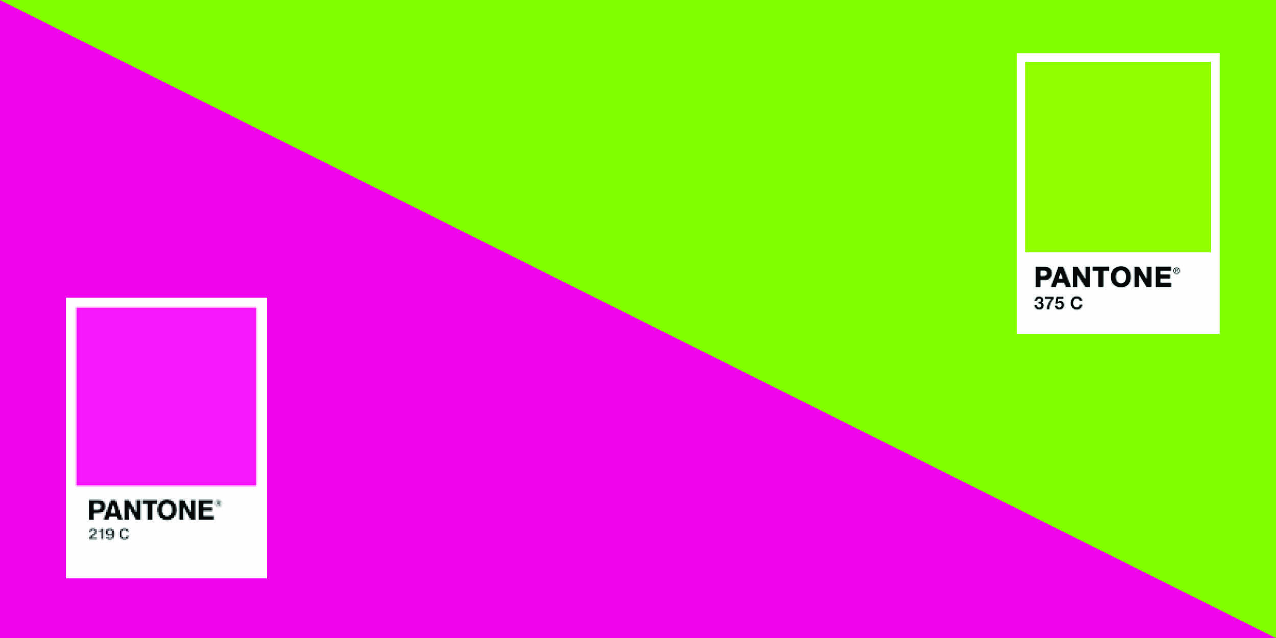
While these colors may be considered garish by some, they were, in fact, small acts of rebellion by refusing to blend in. The seemingly minor choice of deciding to use strong color created not only a cultural touchpoint, but it was also a financial success. Not to imply this was a major reason the Barbie movie or the Brat album were so successful, but it did allow an entry point that was accessible to most people. This accessibility allowed fans to showcase their own spin on these trends by sharing unique fashion and art content on their personal social media accounts reaching an even wider audience.
How can we as fundraisers implement this?
The easiest, fastest, and least expensive way to draw more color into your fundraising campaigns is to start testing it online in ads, lightboxes and email. Unlike traditional print, there are few restrictions — and no additional costs — when it comes to using color in digital art. More appealing is the speed at which one can implement a campaign that takes advantage of a viral moment, and get results on the impact of your color selections. All it takes is an idea, a creator and a platform.

If you have a longer lead time, 4-color process or digital printing are both great ways to make a stronger impact with donors by mail. Implement what will compliment your case for support, or resonate with the audience, without pandering to them:
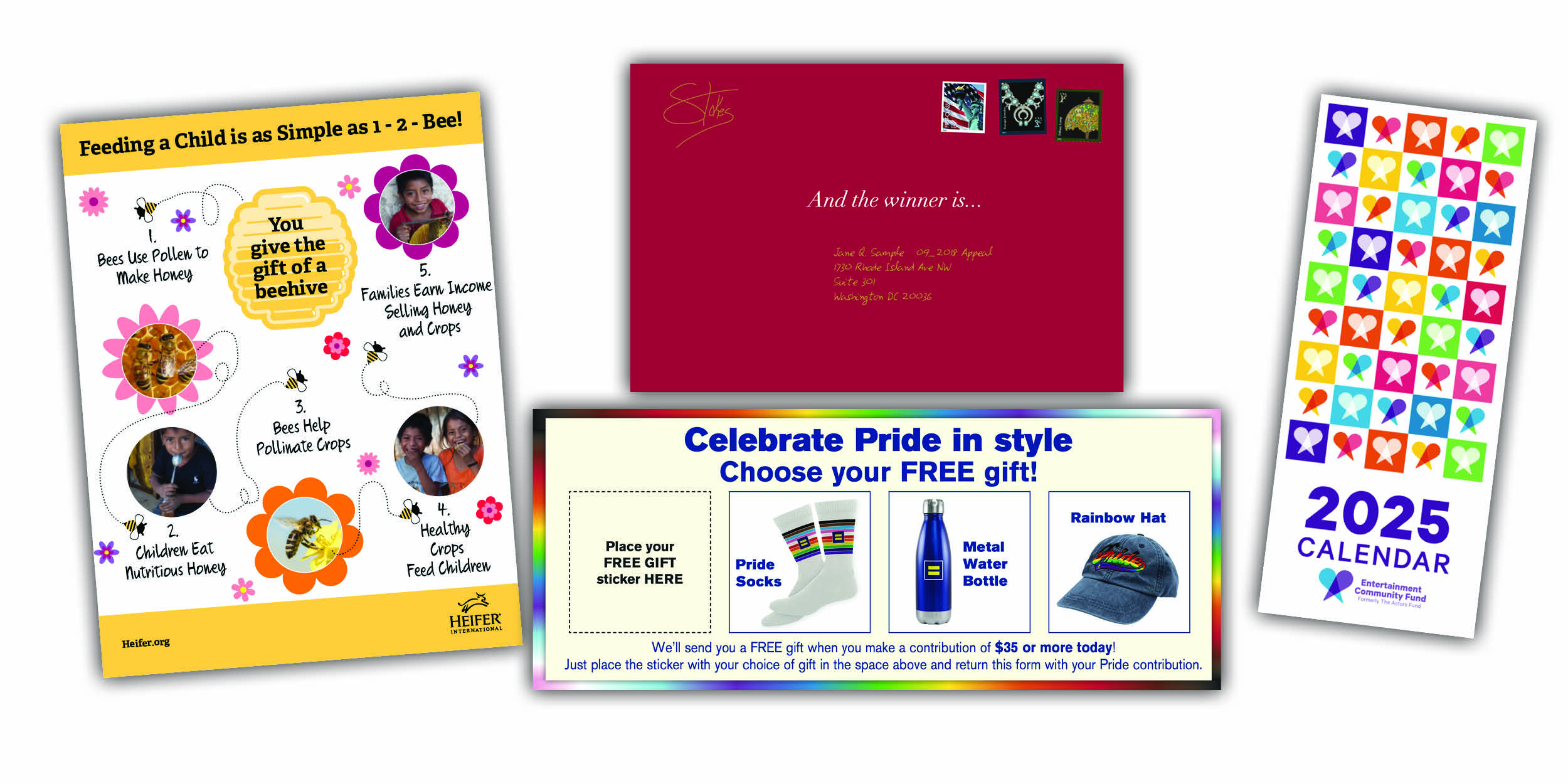
- If your organization benefits children, then bright primary colors can support the content of the package.
- Or the use of rainbows or gradients can add an unexpected element to your fundraising. A caveat being that unless your nonprofit directly benefits members of the LGBTQIA+ community, I would avoid using rainbows during July.
- If your brand guidelines outline a wide array of color choices, then color blocking can be a great way to make a printed piece stand out.
- You can also use spot colors as a font treatment to highlight important pieces of information to the reader. You don’t have to strictly adhere to your brand guidelines if it makes sense. Once you know the rules you can break them.
- Even a single-color direct mail package can be effective with a brightly colored envelope. (I’ll even look the other way if you use a brown kraft in spite of it landing squarely within the spectrum of beige hues.)
Which brings me to my final point: there is a time and a place for all visual elements. If color is appropriate within the context of the audience and content, then, utilize that hue! If beige tones speak to you, then wear them proudly!
The truth is, you might even find a sweater or two in my closet that could be classified as Mocha Mousse.